GoDay.
Reimagining the payday loan.
Outline.
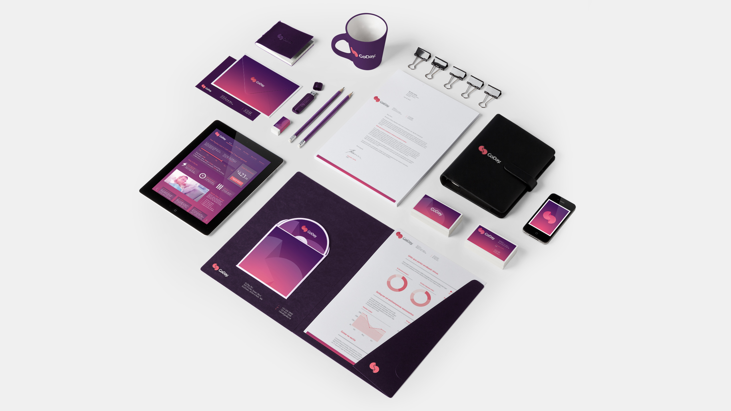
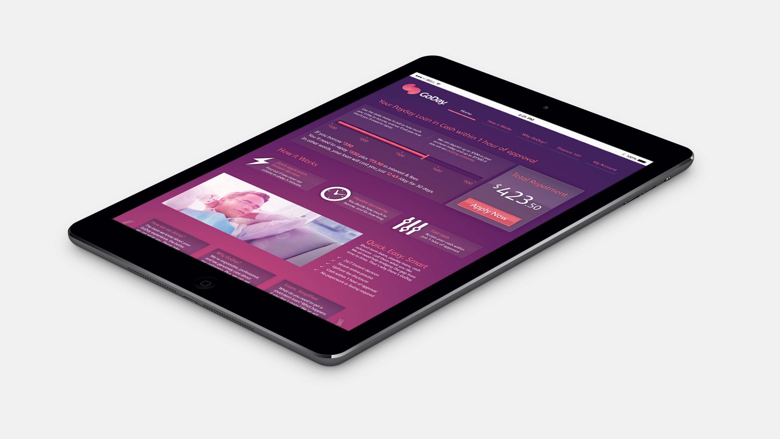
GoDay is a 'small amount' payday loan company that wanted to help people who experienced an unplanned event, like the washing machine dying out of the blue.
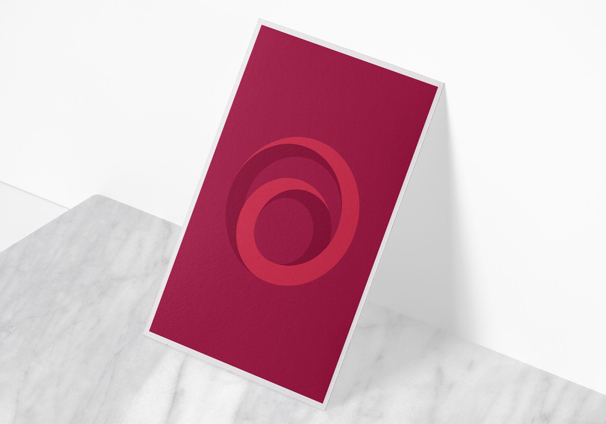
Therefore, we wanted to move the brand away from the traditional 'cheap and cheerful' payday loan marketing and treat the brand more like a fresh modern bank that specialises in safe loans.
This mindset helps create a dynamic brand that was fun and engaging and felt very different from the "get money fast"loan companies.
Disciplines.
- Branding
- Art direction
- Print Design
- Digital Design
